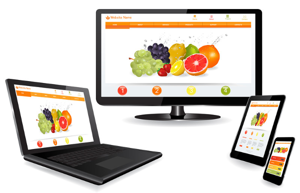
How do I create a mobile / responsive online shop?
![]() With a responsive design your online shop can be displayed on all mobile devices:
With a responsive design your online shop can be displayed on all mobile devices:
- Smartphones and PDA's (horizontally and vertically)
- Tablets (horizontally and vertically)
- Netbooks, mini laptops and ultrabooks
- Laptops and desktop computers
- Smart TV's and projection screens
To support all these devices extra flexibility is needed. Responsive websites are "liquid" and spread the content over the screen for optimal display and usability.
On a responsive online shop all objects are placed below each other if there is insufficient horizontal space. It's possible that on a wide desktop screen 8 products are displayed horizontally and they are displayed below each other on a smartphone.

Activating responsive templates
Navigate to Settings > Layout > Edit. At the top under the cloud icon you can choose a template (or design).
The templates with the  Responsive icon can adapt depending on the screen size of your visitors. These templates work on smartphones and tablets.
Keep in mind
- Avoid using the High quality photos module, these have slower load times and do not scale well on smartphones.
- Do not install widgets or plugins that are displayed above the content of your website. They can fill the screen completely on a smartphone.
- Introduction
- Product management
- Online store configuration
- Account and shop settings
- Payment methods and Payment Service Providers
- Invoices and Terms & Conditions
- Setting shipping costs
- Discounts and surcharges
- Registering and transferring domain names
- Multilingual shop
- Connecting to external platforms
- Personalized web addresses
- Managing multiple webshops (Multishop)
- Automatic emails to customers
- Designing a beautiful layout
- Order management
- Marketing
- Modules
- Backups and exporting data
- Email and web mail
- Administrator accounts
- High quality photos
- Two-factor authentication
- Labels
- META tags - Website verification
- Live chat
- Slideshow
- Visitor analysis - Google Analytics
- Filters
- Point Of Sale (POS)
- Form fields
- Digital or virtual products
- Symcalia reservation system
- Guestbook
- Contacting the helpdesk