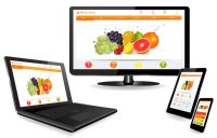
EasyWebshop starts with responsive shops
7 August 2014, 3:15

Last night we have implemented a big layout update to make our shops responsive. Responsive means your website looks good on every type of screen.
On one hand screens are getting smaller e.g. netbooks, tablets and mobile phones. On the other hand, the desktop screens are getting bigger and we use smart TV's and beamers.
To be able to support all these different devices, extra flexibility is needed. Responsive websites are "liquid" and spread the objects on the website across the screen for an optimal display and user experience.

Activating the responsive layout in your shop
Making your website responsive costs €2.500 and takes 5 weeks is free and can be done easily with a few clicks. (Like EasyWebshop's usability!)
Navigate to Settings > Layout > Edit. Here you can choose your template. The new templates are indicated with the green responsive logo. Not satisfied with the results? No problem, you can always undo this and choose your previous template.
The responsive layouts are displayed well in the following web browsers:
- Firefox
- Google Chrome
- Apple Safari
- Opera
- Android smartphones
- iOS (Apple) smartphones
- Blackberry smartphones
- Opera mobile
- Chrome for Android
- Firefox for Android
- Internet Explorer starting from version 11
82,90% of your visitors will see your website perfectly. In other cases your website will function, but small layout problems are possible.
This is because of the older versions of Internet Explorer which are incompatible with responsive layouts. These browsers are used less and less lately. Because of this, the percentage of visitors with compatible browsers will improve in the future.
The number of mobile visitors is increasing. Because of this, it's advised to choose a responsive layout. The choice is yours ultimately: our old templates can still be used.
Hint: experiment with different layout settings. The new interface has lots of features and an unlimited number of combinations is possible. Make sure you have matching color combinations and stay consistent with font styles and layout.
Update: category view, product view and price color
From now on you can choose how your category lists and product lists are displayed. In addition, you can also change the color of your prices.
You can find these settings at Settings > Layout > Edit.
Why was this update necessary?
A few years ago two websites were made: one for PC viewing and one for mobile viewing. Back then, mobile phones didn't have the ability to display websites with advanced scripting. As a result a simplified mobile version was developed with less functionality.
EasyWebshop had a mobile version since the beginning, that worked on the first smartphones. Today, only a few people still own a four year old smartphone.
Smartphones became more powerful and have fast 3G and 4G internet connections now. The only drawback they have, is the small screen.
That's why currently one flexible website is developed instead of two. This has many advantages:
- Customized "flexible" display on every device
- No confusion for visitors
- Better indexing in Google: no double content
- Responsive websites offer complete functionality which mobile websites lacked
- Cost effective: only one website must be maintained instead of two
Help! My shop is not displayed correctly
Usually this is because the old scripting is still in the cache of the web browser. A web browser (Internet Explorer, Firefox, Google Chrome...) saves web pages and images on your hard disk. This way, at your next visit, the page will load faster. When you visit the page, you will see the old version of the website on your hard drive and not the live version.
To solve this problem: navigate to the shop page and click Refresh page or Reload page. You can also use the shortcut keys: F5 or CTRL + R (Command + R on Mac). The most recent version of the web page is now loaded.
The pages in the backend (management interface) may also have to be refreshed.
We are available for suggestions!
From experience we know that after a layout update many tickets are sent with requests for changes. We do the best we can to respond to the tickets the same day, but after a big layout update we can't guarantee this.
Please contact us by sending a support ticket and not by phone. This will help us to manage all questions more efficiently.
- Introduction
- Product management
- Online store configuration
- Account and shop settings
- Payment methods and Payment Service Providers
- Invoices and Terms & Conditions
- Setting shipping costs
- Discounts and surcharges
- Registering and transferring domain names
- Multilingual shop
- Connecting to external platforms
- Personalized web addresses
- Managing multiple webshops (Multishop)
- Automatic emails to customers
- Designing a beautiful layout
- Order management
- Marketing
- Modules
- Backups and exporting data
- Email and web mail
- Administrator accounts
- High quality photos
- Two-factor authentication
- Labels
- META tags - Website verification
- Live chat
- Slideshow
- Visitor analysis - Google Analytics
- Filters
- Point Of Sale (POS)
- Form fields
- Digital or virtual products
- Symcalia reservation system
- Guestbook
- Contacting the helpdesk